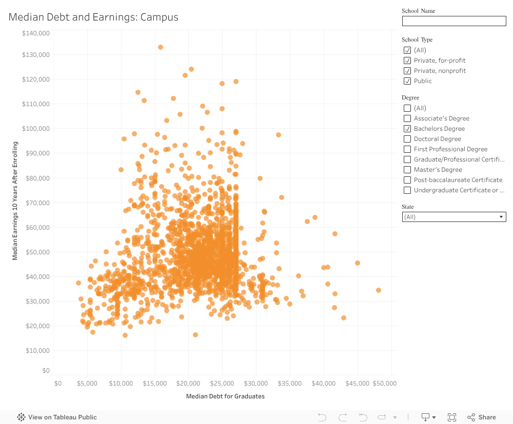
In this story for EdSurge, I sorted through the massive trove of higher education data provided through the U.S. Department of Education’s College Scorecard to develop four interactive data visualizations on the ROI of college for first-time undergrads.
Some of the results were about what you’d expect (med students earnings were highest), but others were surprising (like which schools had the highest debt-to-income ratios).